
Bringing Instructables to handheld devices was essential to growing this dynamic organization.
A clean, elegant, intuitive design was essential in taking this site from computer screen to iPhone.
When my 82 year-old grandmother told me she was using her smartphone to find cookie recipes, I realized how impactful handheld devices are on everyday life. The fact that my grandma’s iMac didn’t change her baking habits while the iPhone did reflects the power of portable computing. Give someone the ability to take their online experience anywhere in the house – or in the world, for that matter – and you see the next phase in the digital revolution at work.
There are websites where “on-the-go access” particularly makes sense, and Instructables is definitely one of them. It’s not always convenient to make a chocolate cake or fix a broken bicycle right in front of your computer. As handheld devices proliferated, it was clear that an app was the best path to solid growth for a company based on publishing and sharing DIY projects.
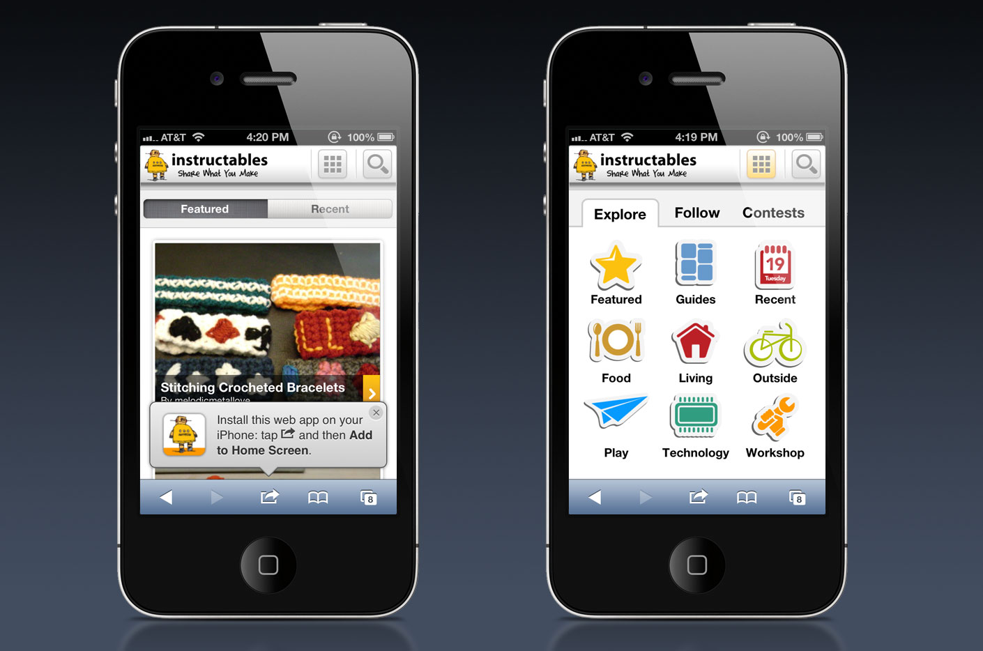
The challenges to the proposed Instructables app were immediately obvious. Handheld devices have relatively small screens, and the average Instructable involves a lot of…well…instructions. An app needed to be capable of presenting a lot of information in a way that was clean, intuitive and user-friendly.
One of our first solutions was to leave the root menu at the top of each page. Not only did this reinforce the Instructables brand regardless of site location, it offers a “back door” for users who wade deep into complex projects.
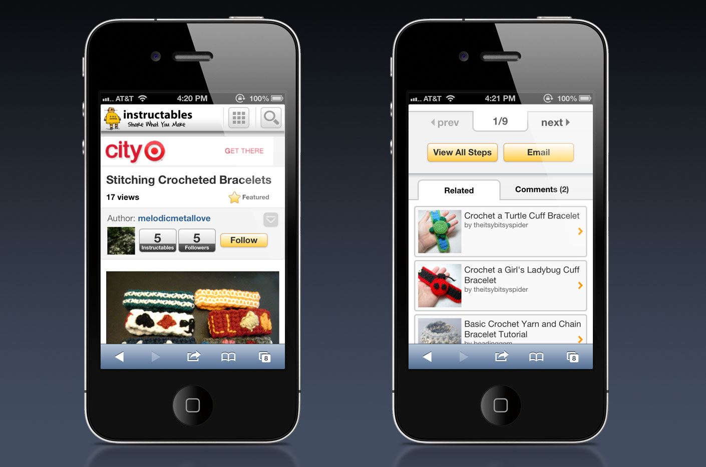
A second solution involved really thinking about the way the site would scroll or slide. We see a lot of designers falling into the pitfall of the “endless scroll,” building apps and sites that roll ever downward. We wanted to prevent the mess this can cause, so that if a user discovers they’ve gone wrong somewhere back at an unknown step in their project they can troubleshoot without twenty minutes of finger-work with their phones. We worked out a solution that tucks complex info away, leaving it in reach and easy to find, but making sure the interface is free of clutter.
We also considered the issue of responsive design. Did it make sense to create an independent mobile website, or would it be more effective to adapt the main Instructables website to function on displays of varying size? We’re big fans of responsive design – pull our site up on your phone and you’ll see that. Working with the client, discussing their needs in detail, we saw that this was a case where a presence on both desktops and handhelds was needed, but there was a distinct difference in what a user would want and expect from the two different access points. In the end, we determined that the best solution was to offer the user a rich, content-driven experience on the primary website, then utilize an independent mobile site as a way for users to pick up their projects and take them out into the world.
We love the Instructables brand, and the power that a site like this has in enhancing its customers’ lives. We were thrilled to bring them to mobile devices, and happy to see their traffic substantially increase as they became available on multiple platforms.
The Challenge: Great big DIY projects, itty bitty screen